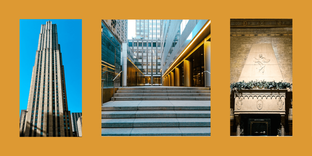
Although Jupiter is paradise (#ILiveWhereYouVacation), it can be homogenous.
We don’t have much of a diverse art culture.
- All of the music is either Country or something like Rock-Reggae (not like The Police but like Sublime).
- All of the buildings, houses or otherwise, pretty much all look the same.
- All of the art looks like this:


Don’t get me wrong: I love both the beach and American Flags.
But living here for my entire life (5 generation South Floridian; my roots go deep), it gets old.
To give you an example of how much we see this stuff:
At our “Arti-Gras” festival of local artists, my wife and I decided to take a drink for every beach-with-a-flag painting we saw and, well, we had to get an Uber home.
We just have a lot of the same, all the time.
So when I decided to take up photography to add to my skills as a local marketer, I got bored really fast.
Naturally, as the son of a designer and an American Institute of Building Design (AIBD) employee, I gravitated towards architectural photography, especially taking photos of houses.
But as I said, they all pretty much look the same around here.
The beach looks the same every time I’m there. No need for more photos of that.
I was refreshed when I went to NYC to visit friends and finally had something different to photograph.
A new problem arose: These buildings are tall and they look very different in photos than when I’m standing there.
Why buildings “lean” in architectural photography
Turns out there’s this thing called “linear perspective” made up of a horizon line and a vanishing point.
Our eyes use this to perceive depth, which is as important to survival now when we’re driving a car as it was when cavemen needed to figure out how far away the mammoth is.
But cameras are made to keep lines straight in a way that allows us to see depth in a two dimensional image.
And that causes perspective convergence, sometimes called keystoning or the keystone effect.
The buildings look like they’re leaning.
Before someone replies with a “well actually…” — I am oversimplifying so that this blog post isn’t too long. If you’d like to learn more about the keystone effect, read this: https://pixelcraft.photo.blog/2020/07/14/why-do-buildings-lean-the-keystone-effect/
How I solved this problem
The easiest, and probably most professional way to solve this problem is to purchase a tilt-shift lens.
A good one of these tend to run around $3000 on average. The best ones cost $6000 or more.
I don’t have that kind of cash for learning a new skill, so I had to resort to software.
Lucky for me, Adobe Lightroom has a feature for this.
They even have an AI that does it for you but I don’t recommend it.
Here’s an example of what the AI does:
Original
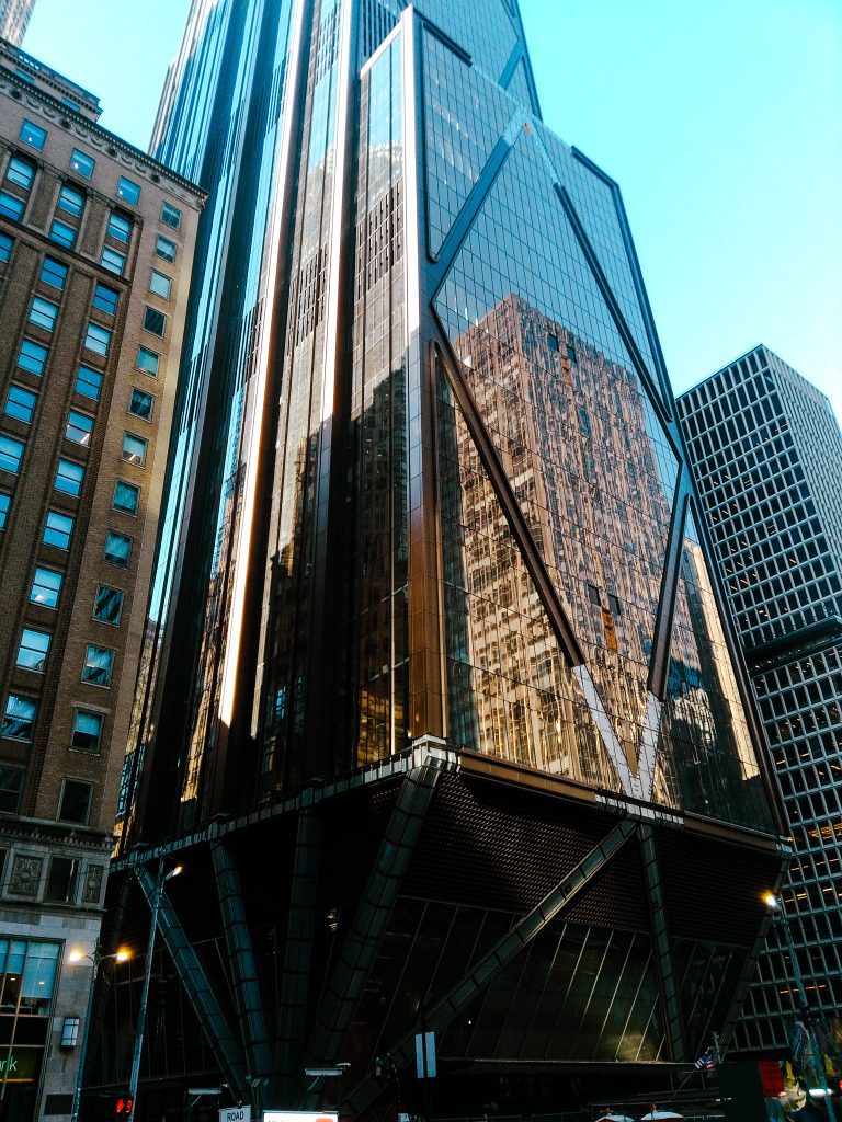
AI “Straightened”
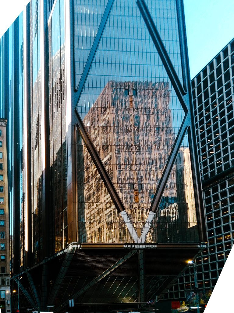
You can see on the whole left side it’s stretched.
And then on the top left and bottom right, corners are cut due to warping. Stylistically I suppose you could be okay with this but it bothers me. Maybe because I know it’s AI’s fault.
I decided I needed to manually learn how to do it.
Manually straightening “30 Rock”
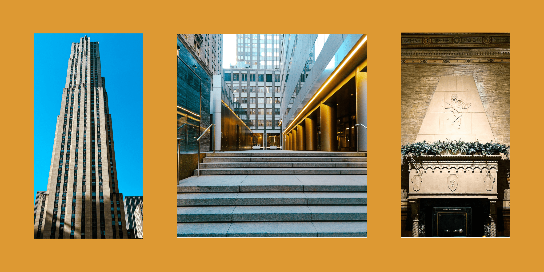
This photo was taken from just above the ice skating rink at the Rockefeller Center.
I manually straightened this one (and color corrected) to show that improvements can be made without AI.
Original
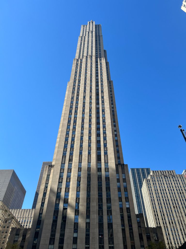
AI “Straightened”
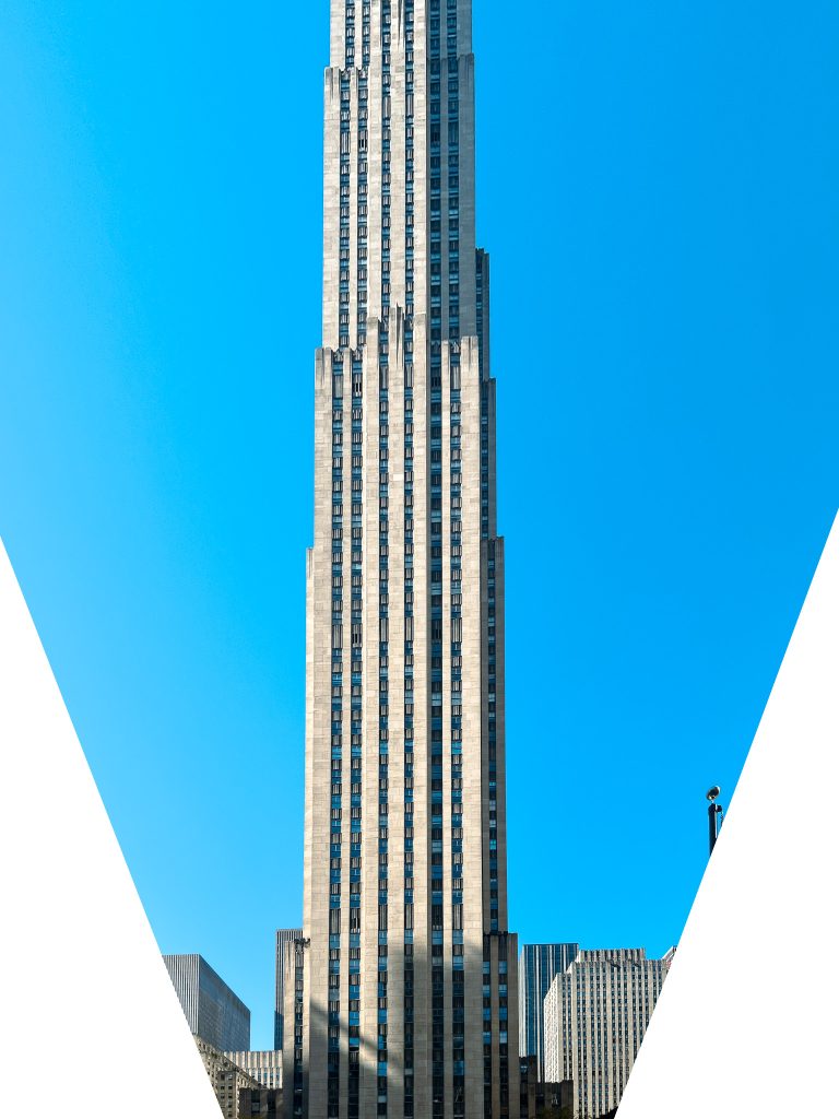
Manually Straightened
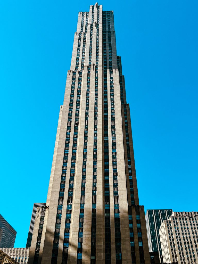
It’s still not perfect, since the building is so tall and I’m still learning, but it is much better.
Perspective is also important in interior architectural photography
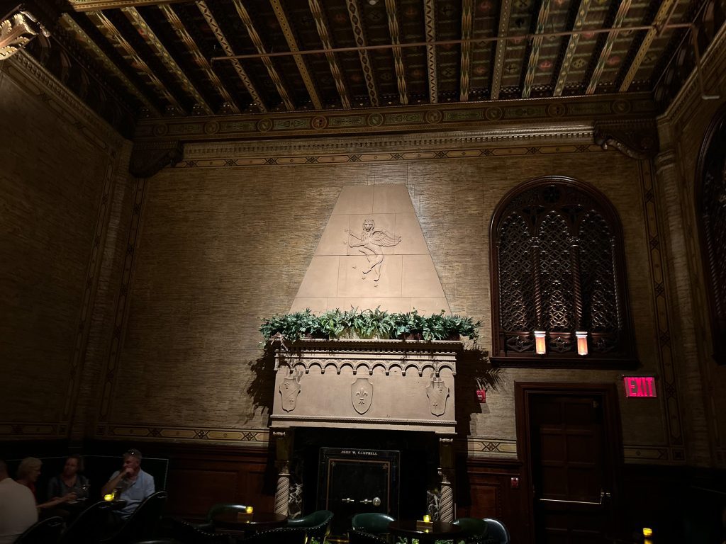
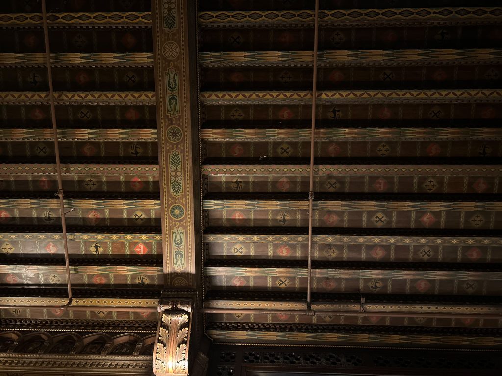
Perspective correction even helps when you’re sitting at the bar and don’t want to stand up to take photos:
Original
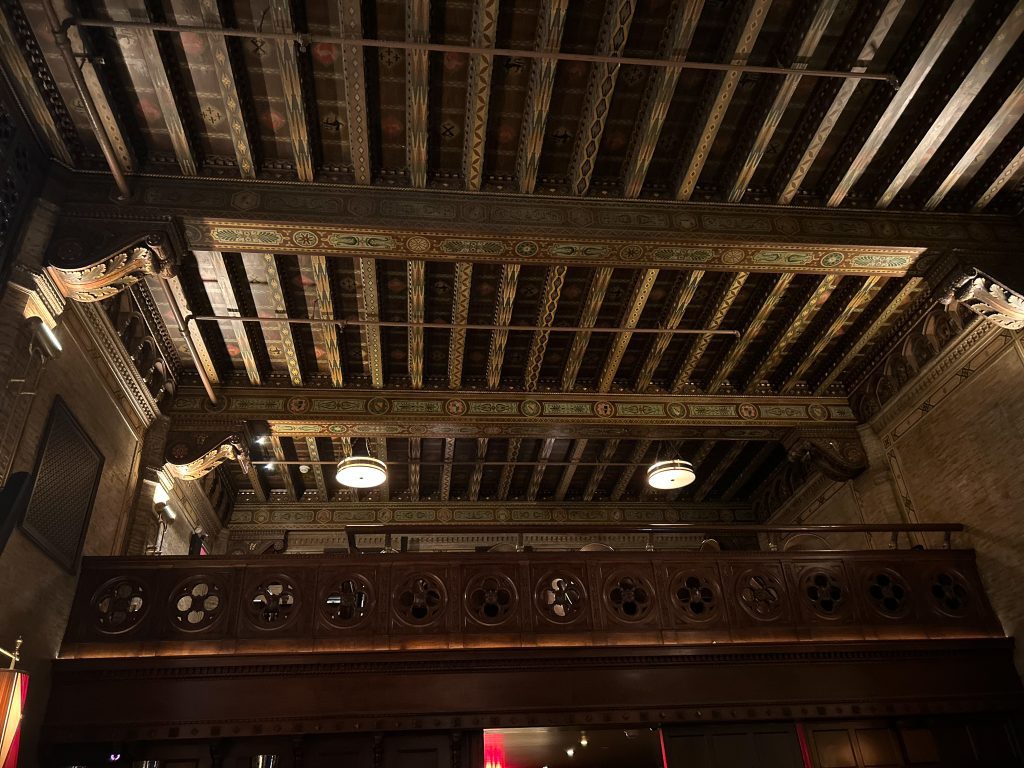
Manually Straightened
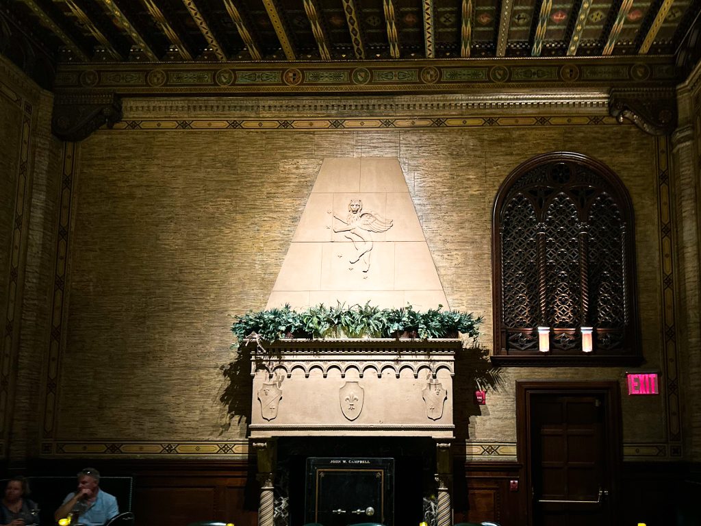
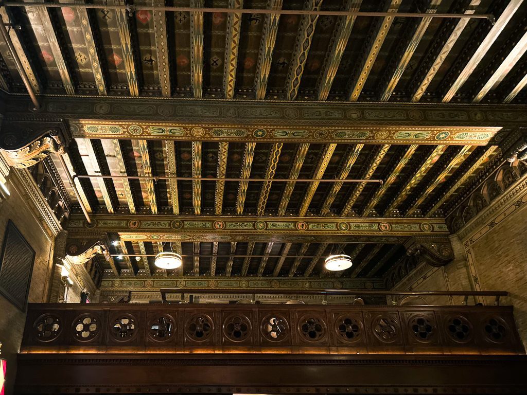
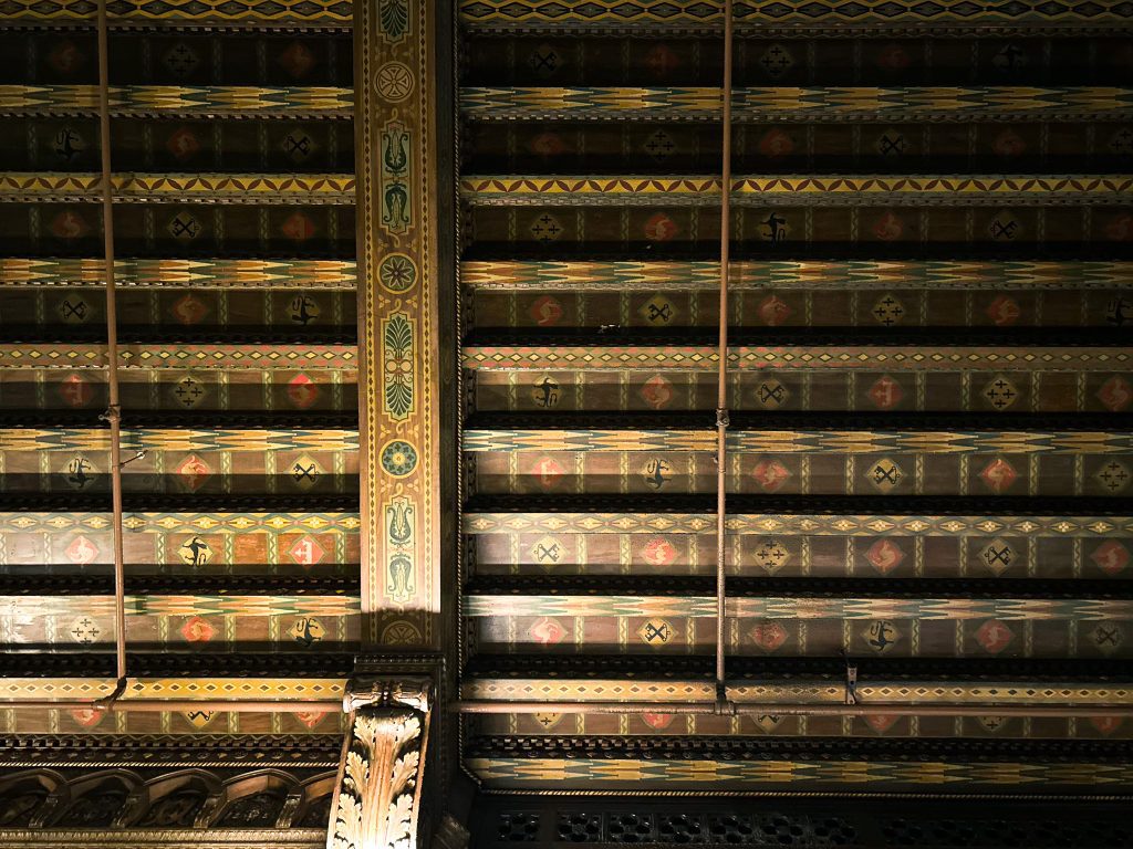
Those were all taken at The Campbell in Grand Central Station.
After learning all of this, I’m left wondering how many of the photographers the AIBD ARDA entrants (particularly the winners) are using tilt shift lenses, “correcting in post,” or not fixing perspective at all.
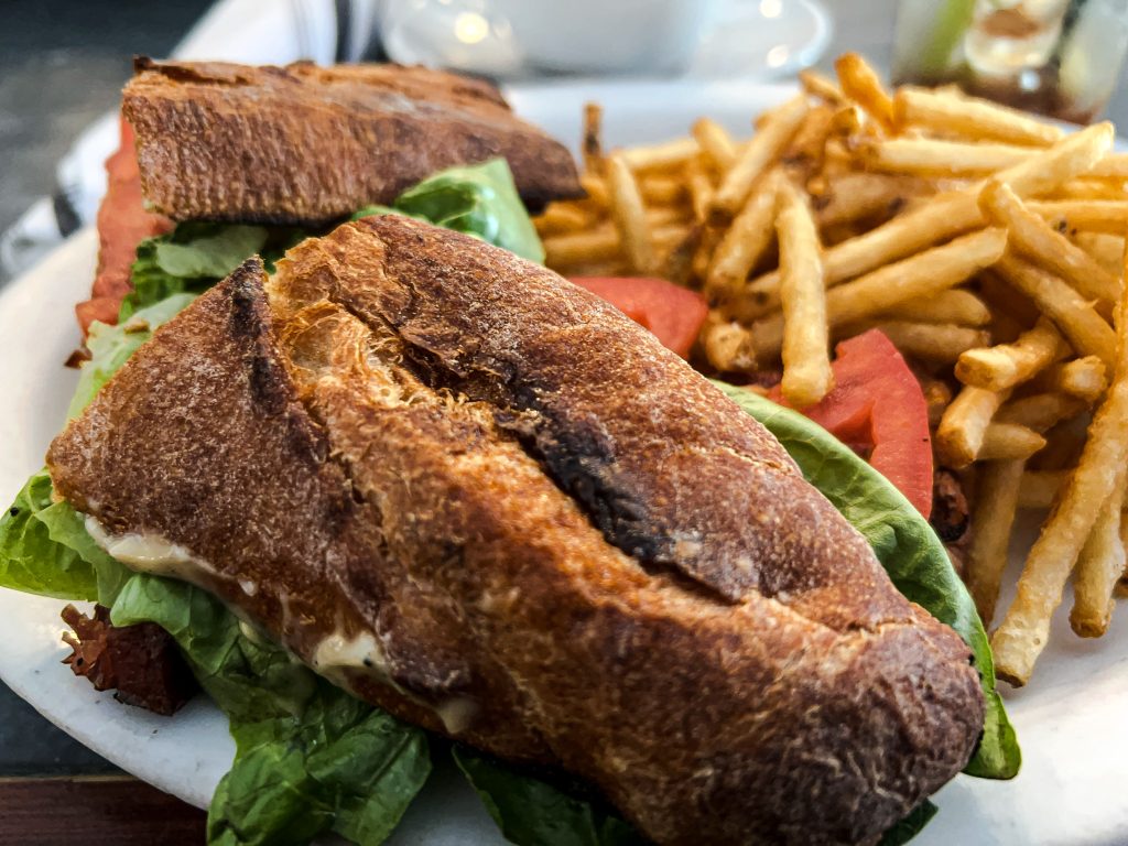
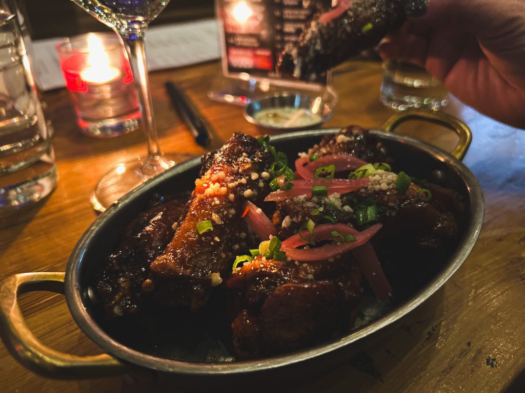
P.S. I’m also working on learning food photography:
Leave a Reply